Picture this: A potential client lands on your law firm’s website after a Google search. They’re in need, ready to hire, and want answers fast. But what happens when your website doesn’t quite meet the mark? You could lose that client before they even call.
Your law firm’s website is more than just a digital placeholder. It’s a 24/7 salesperson. If it’s not performing, your practice could miss significant revenue. Let’s explore how your law firm’s website might quietly work against you — and how you can turn it into a conversion powerhouse.
1. Looks Aren’t Everything, But They Matter
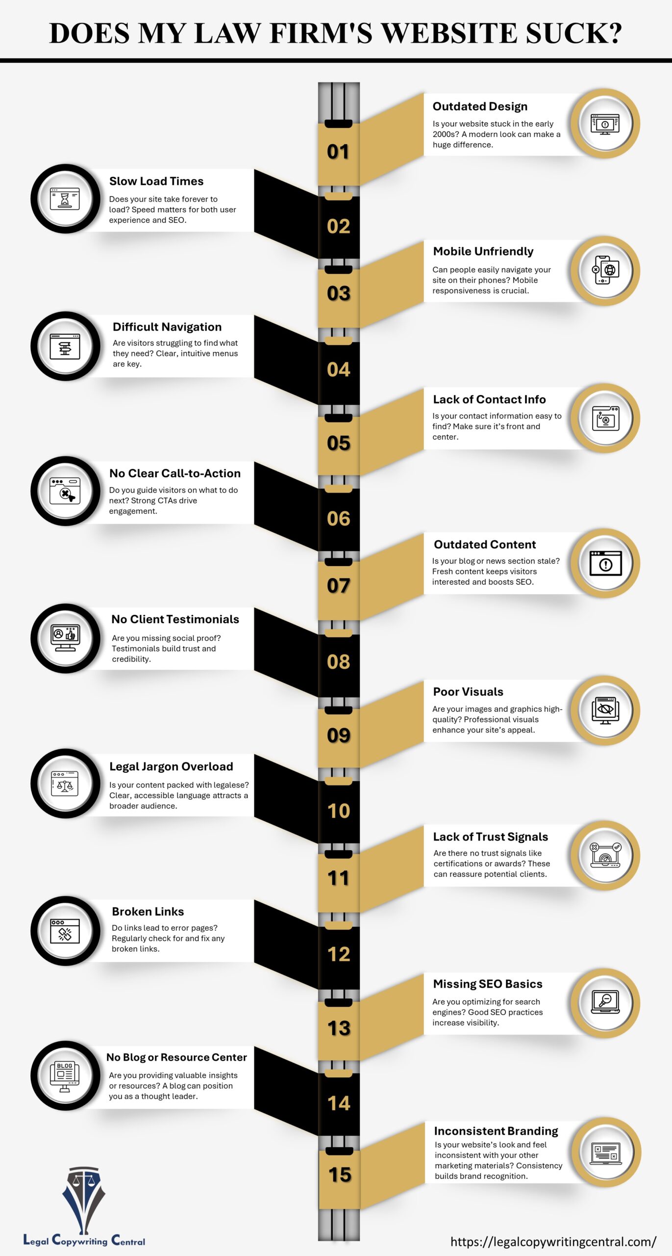
When was the last time you updated your website’s design? A law firm’s website that looks like you built it during the MySpace era sends a clear message: “We don’t keep up.” A tired design can make potential clients question your relevance even if you offer cutting-edge legal expertise. You wouldn’t wear a 20-year-old suit to court, so why is your website still dressed in outdated code?
2. Invisible to Search Engines? That’s a Problem
No matter how outstanding your services are, they’re practically invisible if you don’t optimize your law firm’s website for SEO. Clients rarely scroll past the first page of search results. Are you missing out on organic traffic? That could explain why your phone isn’t ringing as much as it should be.
3. The Two-Second Rule: Attention Spans Are Shorter Than You Think
Ever clicked away from a site because it took too long to load? So have your potential clients. Your law firm’s website should load fast enough that visitors don’t even think about speed. People aren’t patient online; ensure they can get the necessary information in seconds.
4. Personality, Please!
Does your law firm’s website have any personality? Potential clients want to know who they’re working with. Bland, overly formal content feels cold and impersonal. It’s essential to strike the right balance between professionalism and approachability. Your site should reflect what you do and who you are as a law firm.
5. Don’t Make Me Think: Simplify, Simplify, Simplify
Your law firm’s website shouldn’t be a puzzle. Every click, scroll, and search bar should guide visitors to the necessary information. Complicated navigation is a one-way ticket to high bounce rates. A well-organized site shows clients that you’re capable of solving problems efficiently.
6. Mobile or Bust
Here’s a reality you can’t ignore: More people browse the web on mobile devices than desktops. If your law firm’s website isn’t mobile-friendly, you’re not just losing clients — you’re losing credibility. Visitors need to quickly contact you or read through your services.
7. Where Are the Humans?
People trust people, not faceless corporations. If your law firm’s website doesn’t have testimonials, case results, or even staff profiles, you’re missing out on a prime opportunity to build trust. Let your satisfied clients do the talking. Testimonials work like mini-closing arguments, convincing potential clients that you’re the best choice.


