You’re not just a lawyer.
You’re also the firm’s strategist, rainmaker, and voice.
So when it comes to building trust online, fast, you need more than a website.
You need a landing page that knows exactly what it’s doing.
Because how to build a high-converting landing page for lawyers isn’t just a technical search anymore.
It’s a growth decision.
Not surprising. Landing pages aren’t brochures. They’re bridges.
Done right, they help overwhelmed, cautious, skeptical humans become hopeful, decisive clients.
Done wrong? They’re digital tumbleweeds.
So here’s how to build a high-converting landing page for lawyers that doesn’t just look good – it performs. This is the serious, strategic, no-fluff breakdown you didn’t know you needed.
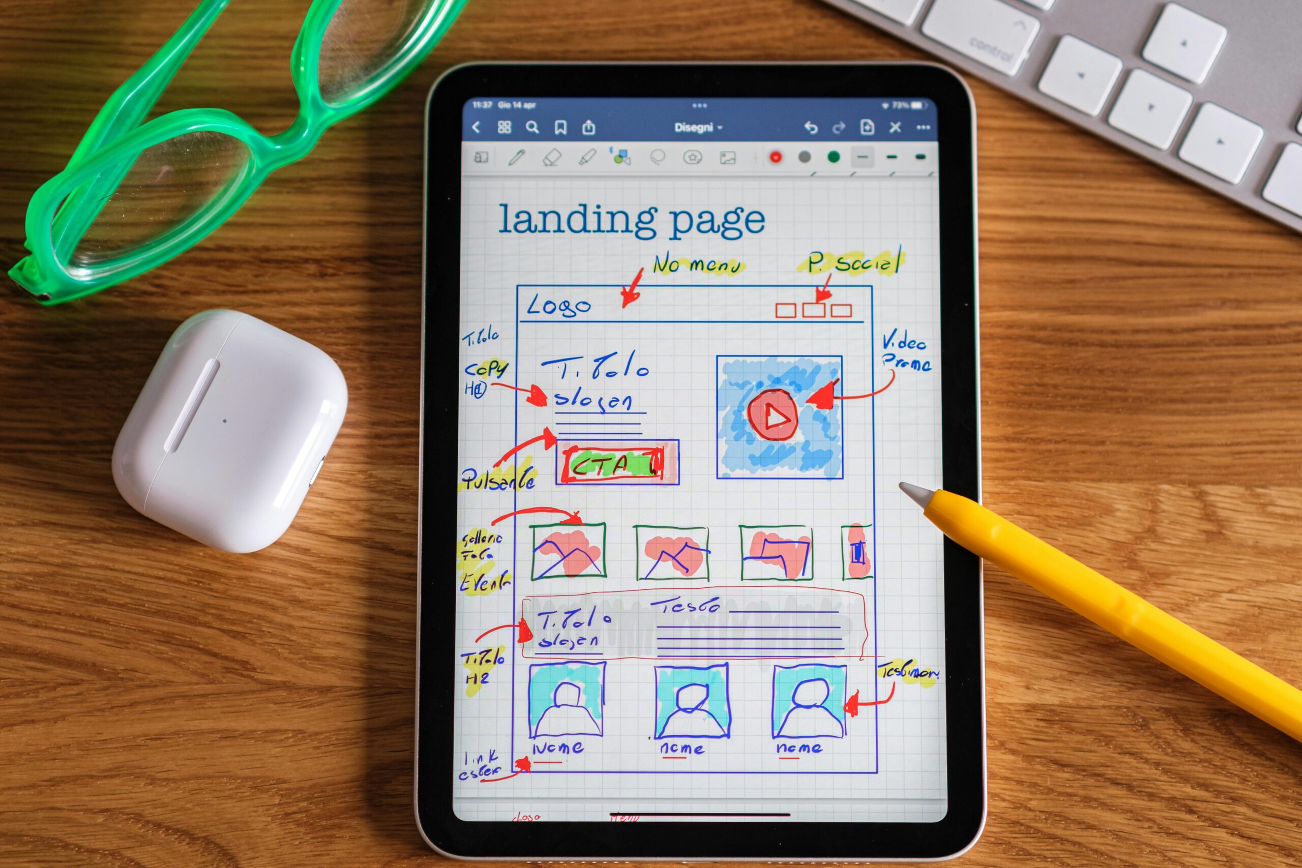
Start With Empathy, Not HTML
Before pixels, before plugins, before page builders—start here:
Who is this page for, and what hell are they walking through?
You’re not writing for “site visitors.”
You’re writing for:
- A mother terrified of losing custody
- An injured worker unsure how to pay rent
- A spouse Googling “divorce lawyer” from the car
The first step in how to build a high-converting landing page for lawyers is to speak directly to the storm your reader is standing in.
Use real-world insight, not marketing assumptions.
Ask:
- What’s keeping them up at night?
- What’s the first question they’ll ask out loud?
- What do they fear other lawyers will do—or not do?
Get this wrong, and nothing else on your page will matter.
Craft a Headline That Hits the Nerve
Forget “Experienced Legal Help.” Delete “Here to Help You.”
You’re not a slogan. You’re a signal.
Try:
“You didn’t plan to need a lawyer. But now that you do—let’s make this easier.”
Or:
“They’ve got a team. You’ve got us. We don’t back down.”
The headline isn’t the whole pitch. But it should feel like the first breath they’ve taken all day.
Use Subheadings Like Emotional Handrails
You’ve got their attention. Now guide it.
Strong subheadings deepen trust. Like:
- “We’ve handled hundreds of cases like yours. None of them were just business to us.”
- “You’ve done the hardest part—getting here. Let us carry the next step.”
A great subheading calms cortisol.
It tells your reader: “You’re not crazy. You’re not alone. And we’re already thinking five steps ahead.”
Make Your CTA Feel Like Relief, Not a Risk
Here’s where most legal landing pages collapse: the call-to-action.
“Submit” isn’t a CTA. Neither is “Contact Us.”
Try:
“Start your case review – zero pressure, just answers.”
Or:
“Let’s make sense of this. Book a free call that puts you back in control.”
It’s not just about what the button says. It’s about what the button means.
A CTA should feel like someone handing them a flashlight in the dark.
Add Testimonials That Feel Like Stories, Not Ads
The difference between trust and bounce? Social proof.
But this isn’t Yelp. Use real stories, shaped for impact.
Example:
“Other lawyers talked over me. These folks? They listened first. And then they brought the hammer.”
Or:
“I didn’t think anyone could fix the mess I was in. They didn’t just fix it; they fought like I was family.”
Include:
- Short quotes
- Star ratings
- One-sentence case wins
Don’t be afraid to edit for clarity and emotion. You’re not fabricating. You’re translating.
Make Your Unique Value Unmistakable
“We’ve got 40 years of experience.” That’s a résumé. Not a reason.
Your unique selling proposition (USP) should sound like no one else in your market.
Try:
“We win cases with empathy and fire. The courtroom isn’t a warzone. It’s a story well-told.”
Or:
“You get one shot at justice. We’ve built our practice making sure it counts.”
If your USP could live on 12 other lawyer websites, it isn’t yours.
Mobile Isn’t a Feature—It’s the Front Door
Over half your traffic will view your landing page on their phone. Probably while standing outside a courthouse.
So:
- Design for thumbs
- Use large tap targets
- Keep pages fast
- Prioritize legibility
- Keep call buttons fixed and obvious
People shouldn’t have to zoom in to find hope.
A/B Test Like a Scientist, Not a Stylist
Fonts and colors? That’s branding.
Testing? That’s conversion.
Try testing:
- Empathy vs. urgency headlines
- “Speak With a Lawyer” vs. “Book a Call Now” CTAs
- Real photo of your team vs. stock images
Use tools like Unbounce, or Convert.
Treat every visitor as data that’s whispering what works.
Legal Compliance Isn’t Optional
Boring? Maybe. Necessary? Absolutely.
Your landing page should:
- Include accessible, readable disclaimers
- Feature a transparent privacy policy
- Comply with Americans with Disabilities Act (ADA) requirements
Compliance protects everyone, especially you.
Launch, Learn, Iterate
Once your page goes live, your work isn’t over.
Use analytics tools to track:
- Bounce rate (Did they panic?)
- Form abandonment (Did it feel like a chore?)
- CTA click-throughs (Did they find the flashlight?)
How to build a high-converting landing page for lawyers?
Simple.
Launch.
Listen.
Refine.
Repeat.
Bottom Line
You don’t need a prettier landing page. You need a braver one.
One that speaks human.
One that shows up in the middle of someone’s personal crisis with clarity and steel.
One that makes them think, “Finally. Someone gets it.”
So yes, you now know how to build a high-converting landing page for lawyers.
Now go build it.
And if you’d rather have help?
📩 Email me directly. Let’s make it better together.
📅 Book a call: Right HERE